Project: Burger King – A Case Study & Heuristic Evaluation
Role: UX Researcher & UI Designer
Tools: Figma
◊ Problem Space
During the pandemic, many Users moved toward digital interactions to complete their daily tasks. The Burger King rebranding applied to their mobile app as well. Users of the app complained of some confusion around the ordering process.
With this in mind –
How might we help Users place their orders effortlessly without added confusion?
Findings
◊ Methodology
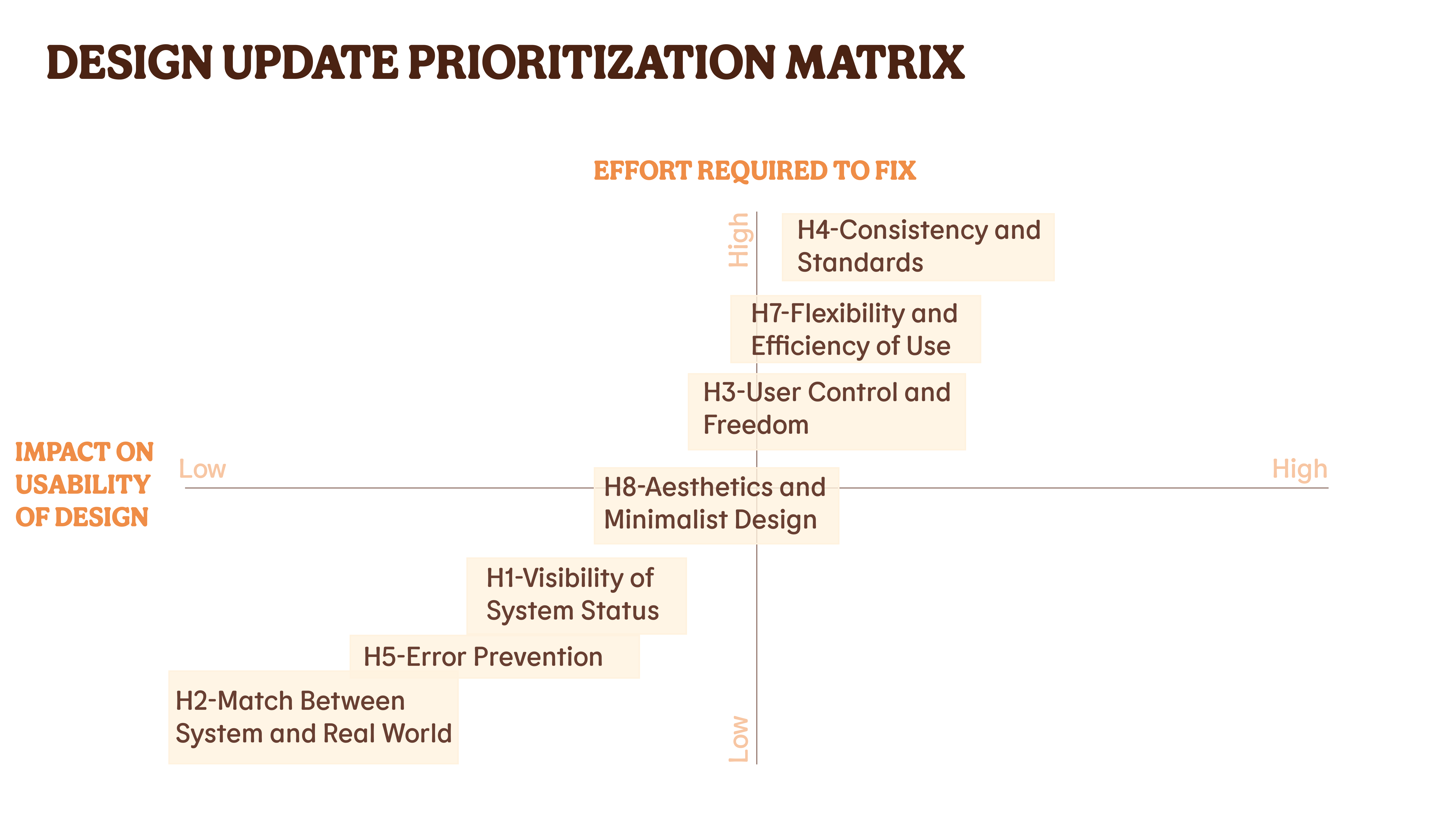
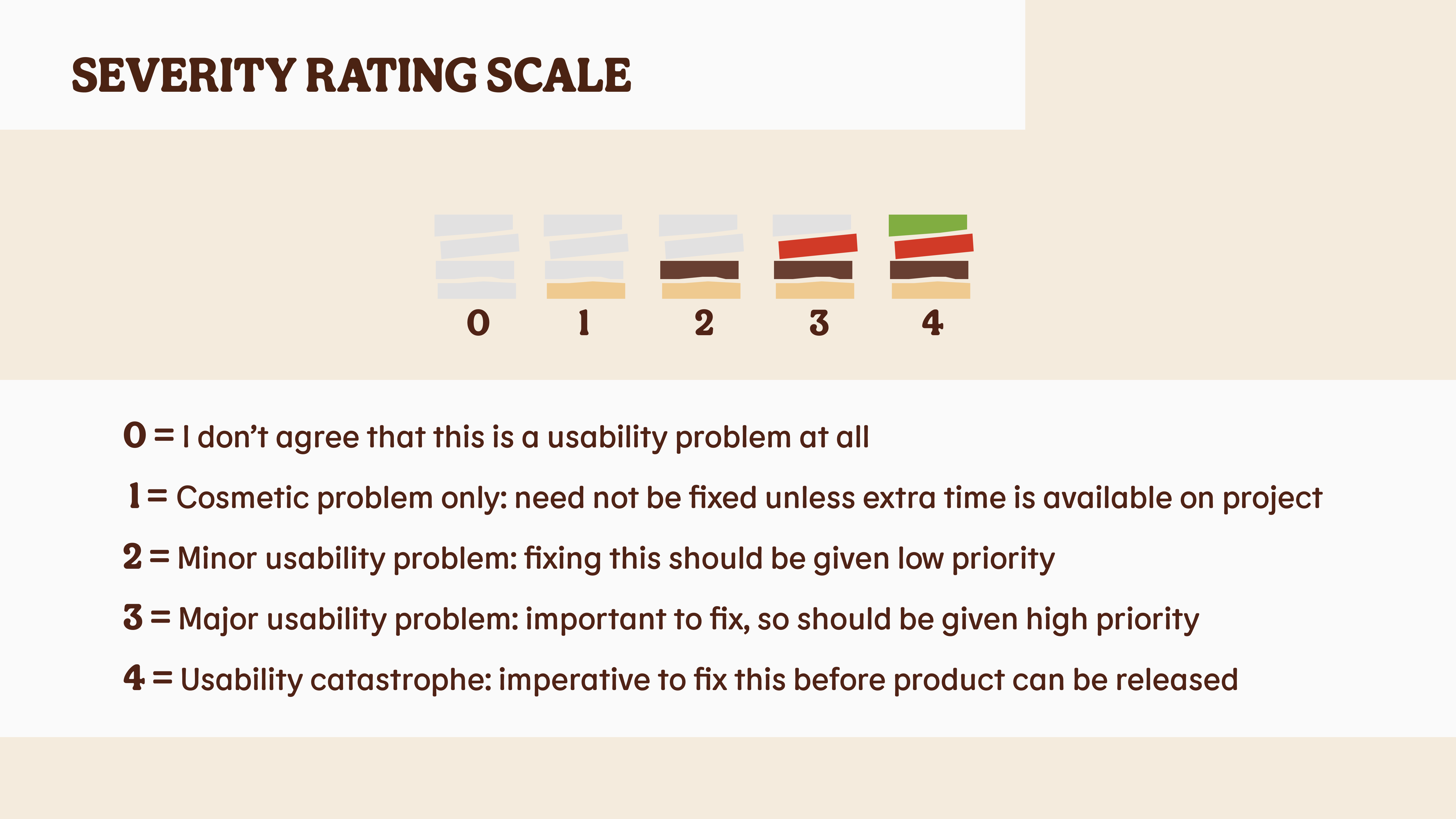
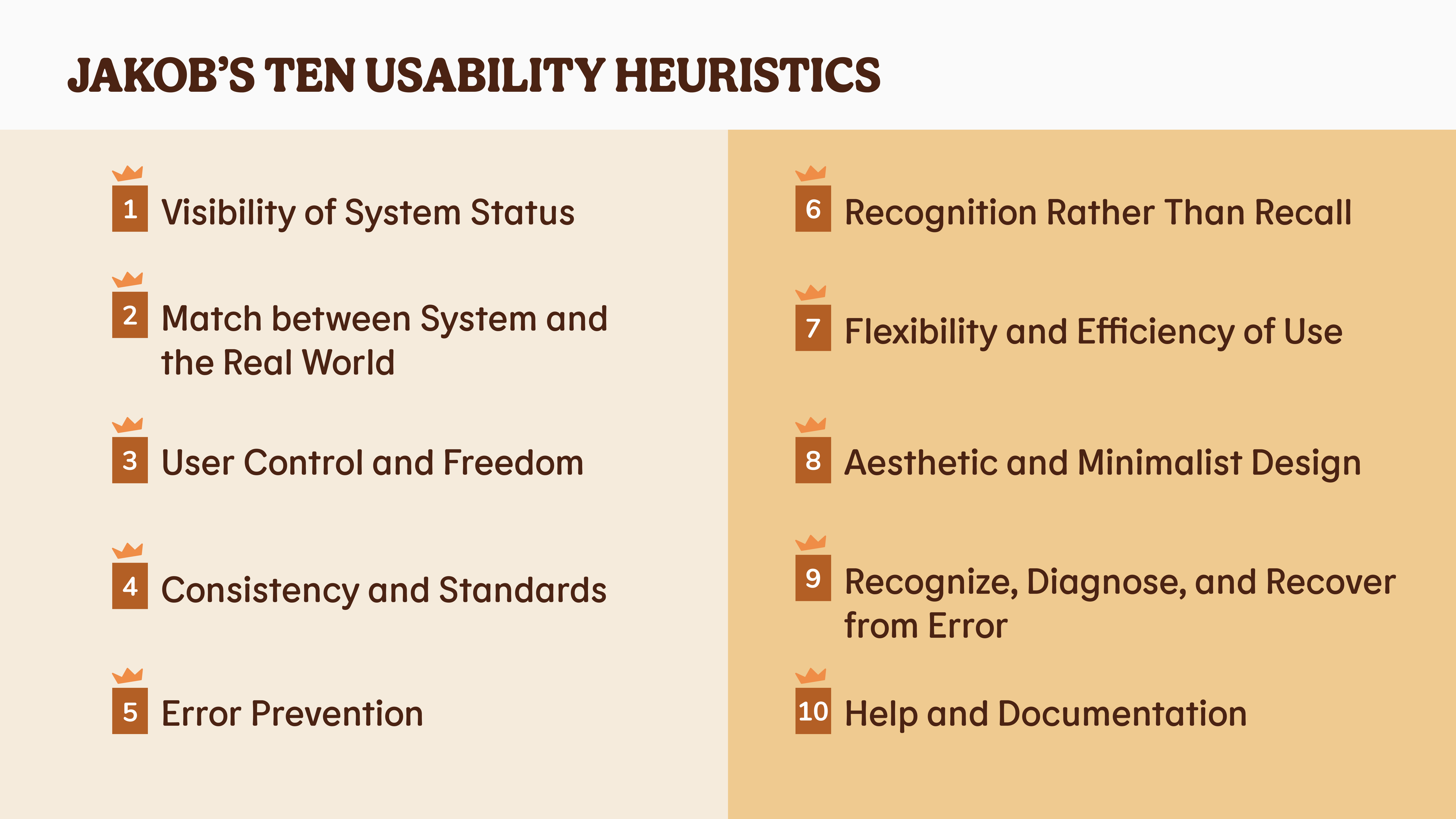
Using “Jakob’s Ten Usability Heuristics” to identify potential usability problems there were a few obvious areas of user-difficulty.
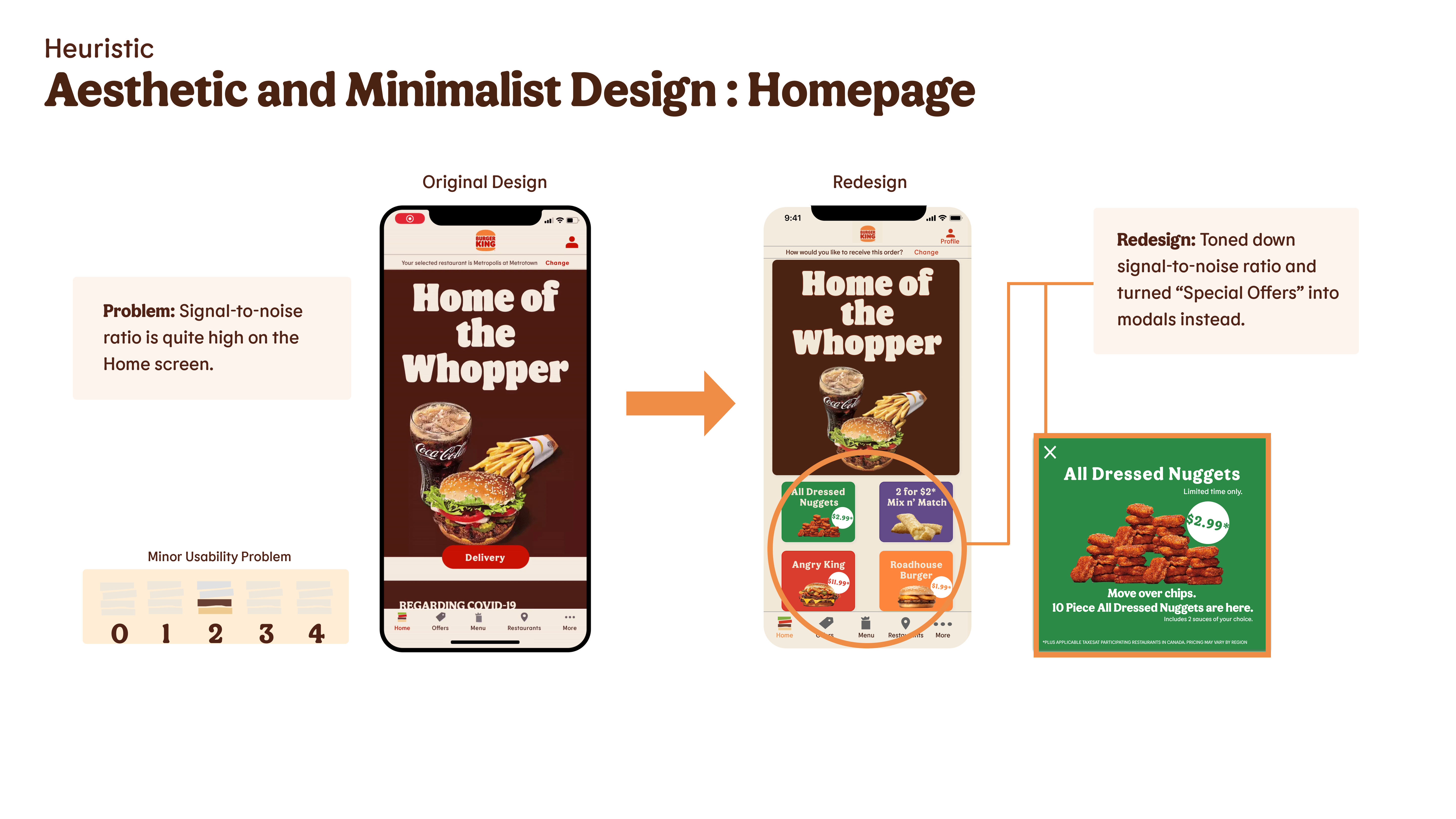
Overall, the app was mostly user-friendly but there were still a few points of the interaction that would cause confusion to the User.
Organizing them by severity, a clearer user flow was determined and an efficient redesign was established.
◊ Outcome
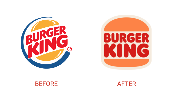
The new rebranding took on a flat design aesthetic, trading in their previous rich design of gelled full textures with multiple colours and surface finishes.
With some small usability tweaks to the ordering process, the redesign added a complementary flow for User Interaction and Usability.
Users found the ordering process easier after implementing the redesign.
◊ User Flow
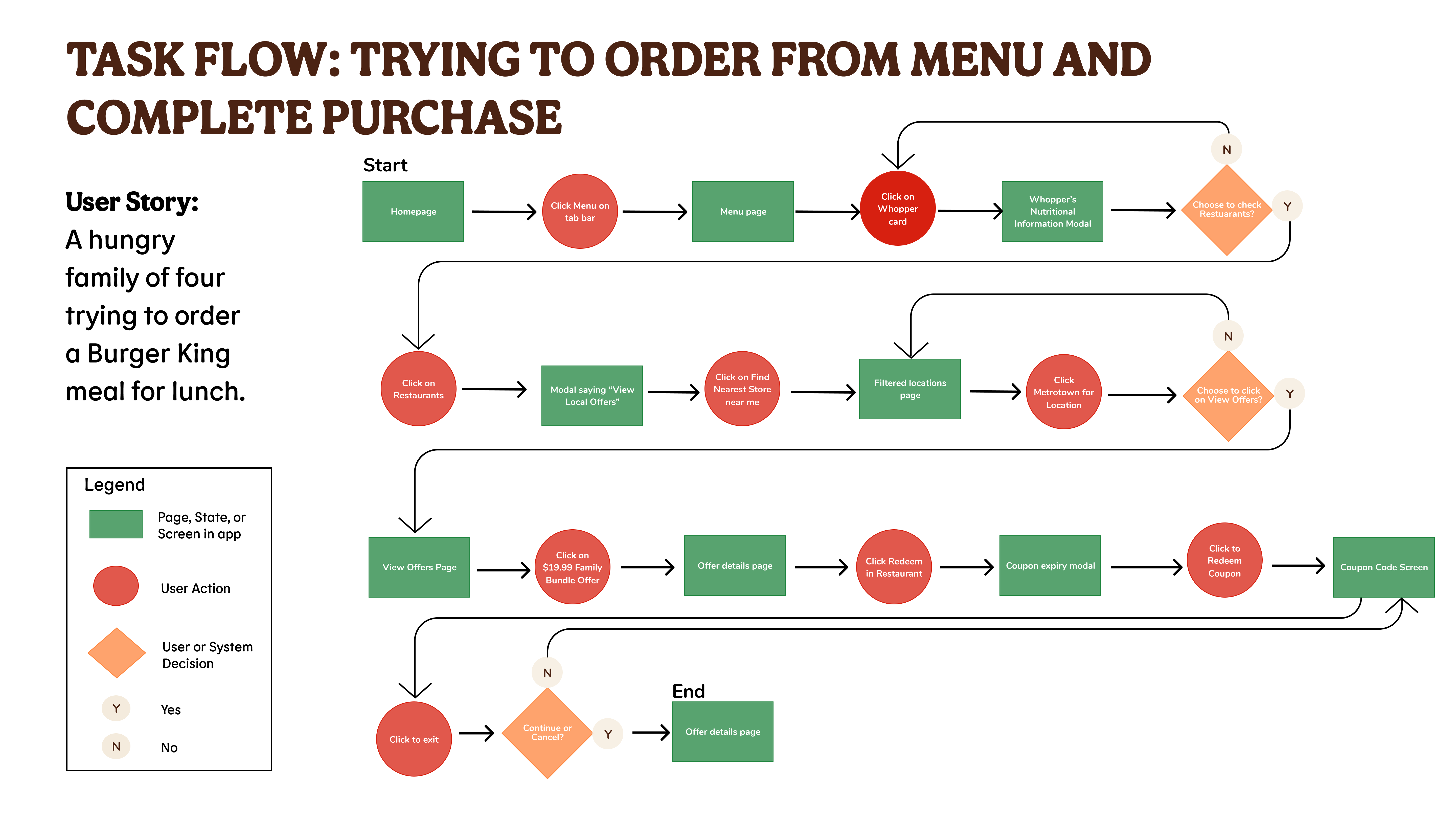
The User, buying meals for her family, searches the app for burgers. She adds a Whopper to her order.
In her cart, she chooses to pick up her order at her preferred location. She pays for the meal, gets a confirmation, and gets ready to go pick it up.
◊ Changes Implemented
Upon first interaction with the Burger King app, trying to complete the task of adding food to the cart the following Usability issues arose:
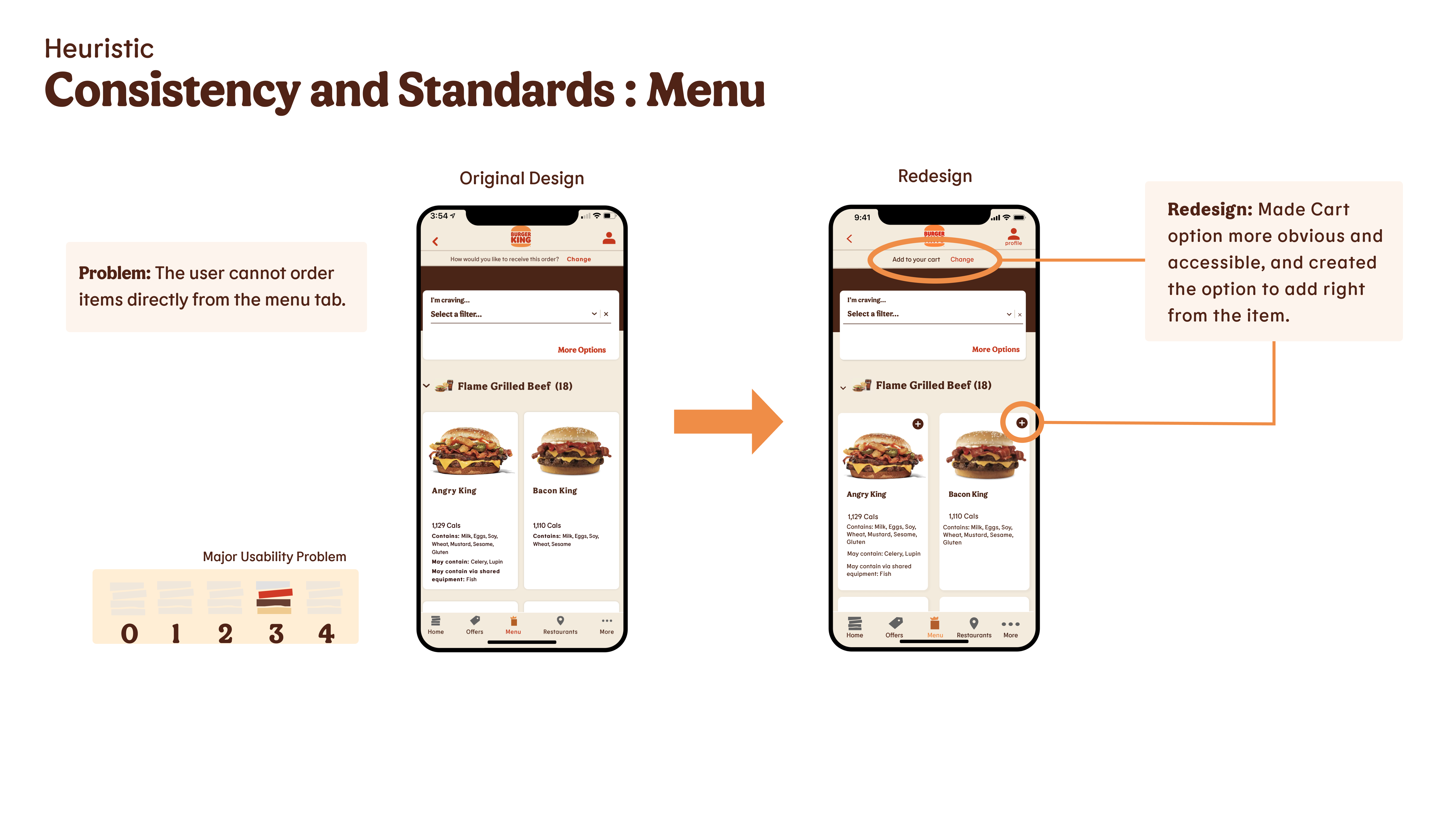
• It was difficult to add the item directly from the menu tab
SOLUTION: Created an “Add” button on each item, making the option more obvious and accessible.
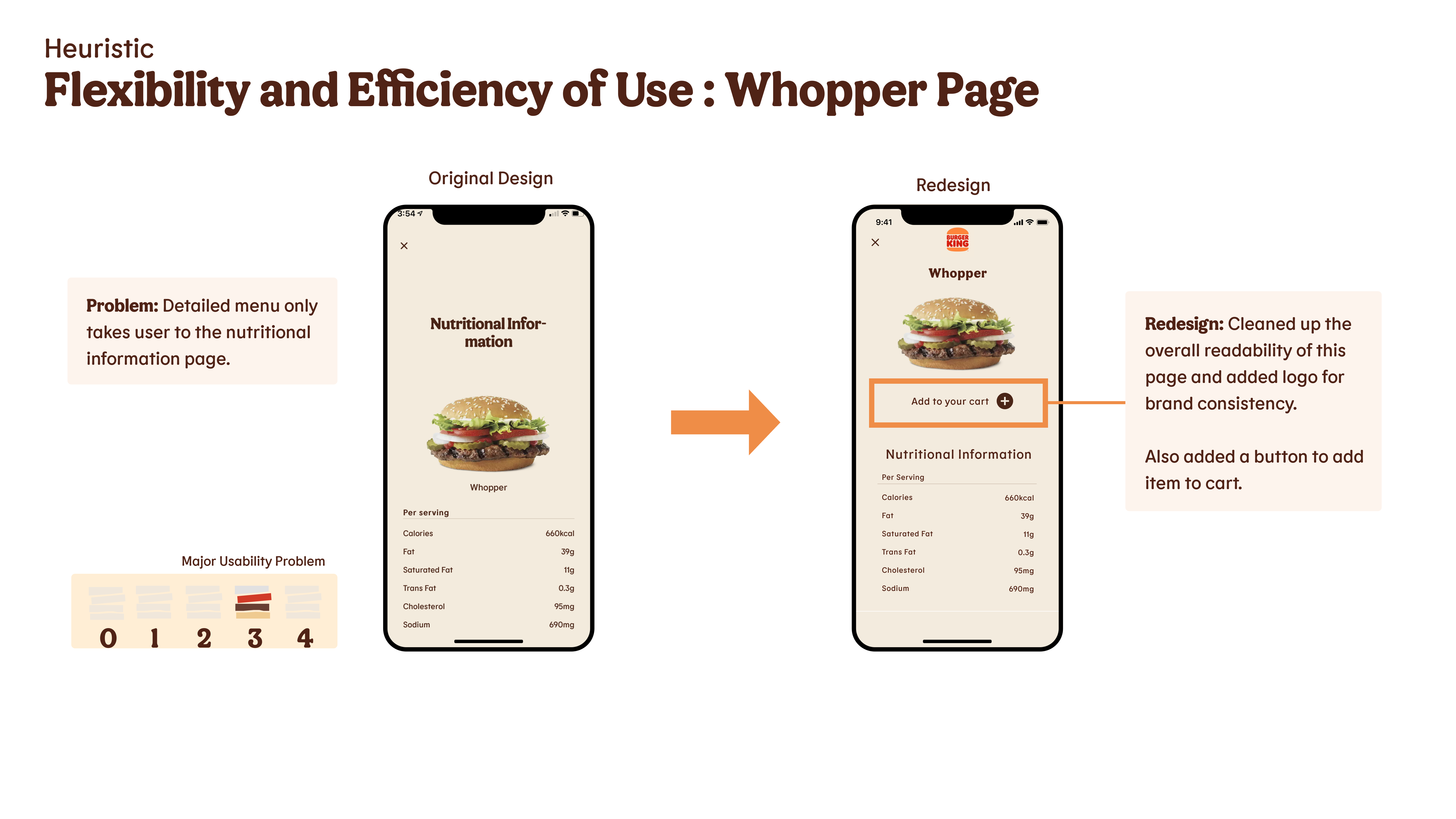
• The detailed menu only showed the nutritional info of the item, making the User go back to add it to the cart
SOLUTION: Cleaned up the overall readability of the page, added a button to add the item to the cart and added a logo to increase brand visibility.
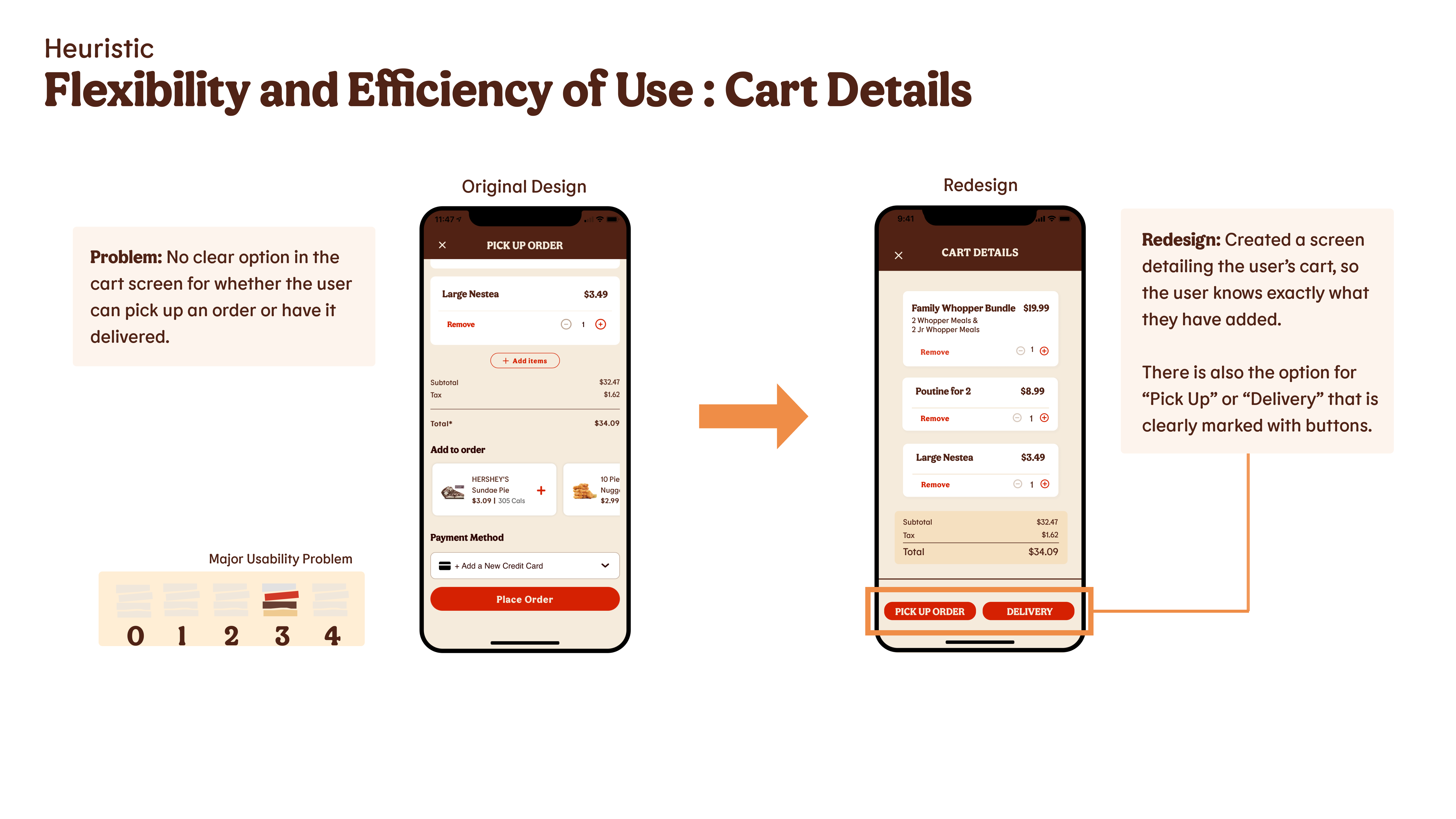
• It wasn’t clear in the cart screen to know how the order would be accesses, delivery or pick up.
SOLUTION: Created clear buttons with options, and clarified the details of the order in the cart.
Jakob's Usability Heuristics & Severity Rating Scale
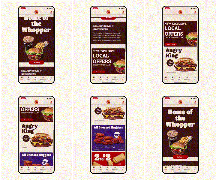
4 Examples of the Heuristic Evaluation & Redesign Comparison
User Task Flow & Design Prioritization Matrix
